Home » Research and Knowledge » Mzalendo Style Guide
This website and the accompanying Guidelines contain practical advice on how to apply the visual identity of the Mzalendo Trust. Our aim is to ensure that everyone within Mzalendo Trust – from the Mzalendo Trust Headquarters (HQ) in Nairobi to partners ans suppliers – represent the Mzalendo Trust in the same way.
The style guide is meant to ensure consistency across all our communication materials.
Introduction
The Logo
Supporting Visual
Descriptor
Font
Templates
Download the General Style Guidelines
The Mzalendo Logo is a recreation of the National flag, without the emblem. The colors of the flag are meant to resonate with the patriotic nature of our work.
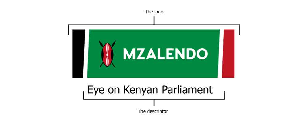
The Mzalendo logo and descriptor (slogan) have been specially designed as separate units and don’t have to be used together at all times. In some instances however, the logo and descriptor will be used together for example on banners.
This may be used to support the logo in large word documents or power point presentations. It must not be used as a stand alone however.

Download the supporting visual
Eye on Kenyan Parliament. The Descriptor must always be presented as one line.
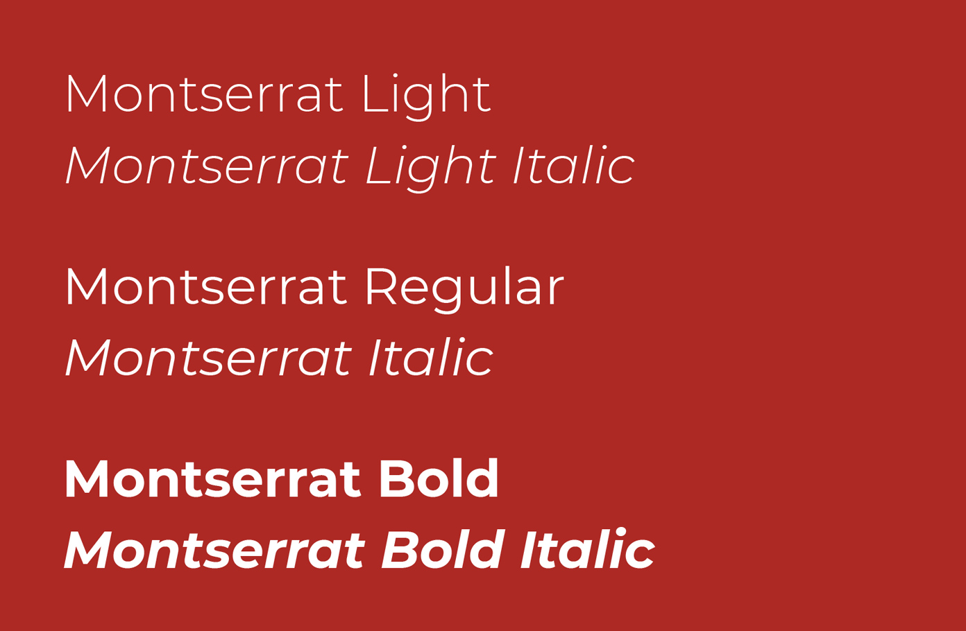
Our choice of typography for communication is Montserrat. Font should be easy to read, friendly to the eye and appealing.
It should communicate:
In general, business cards for the country offices are printed in the Nairobi.
Other offices can also choose to use the Illustrator template for printing in their own areas.
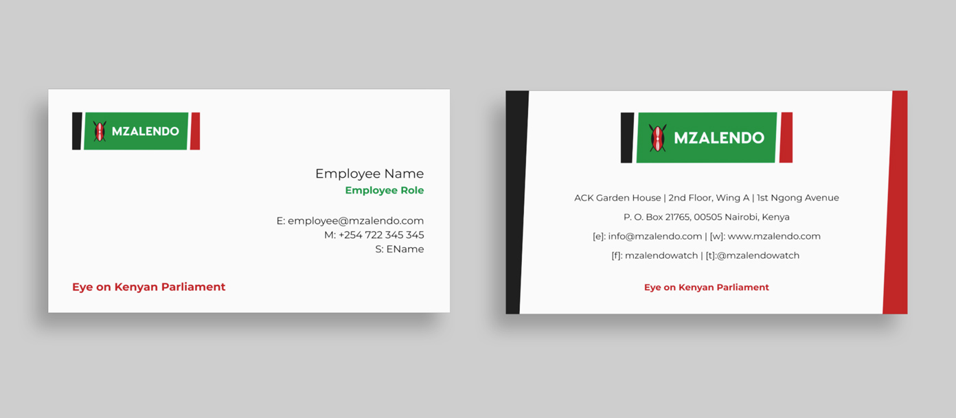
Download the business cards template
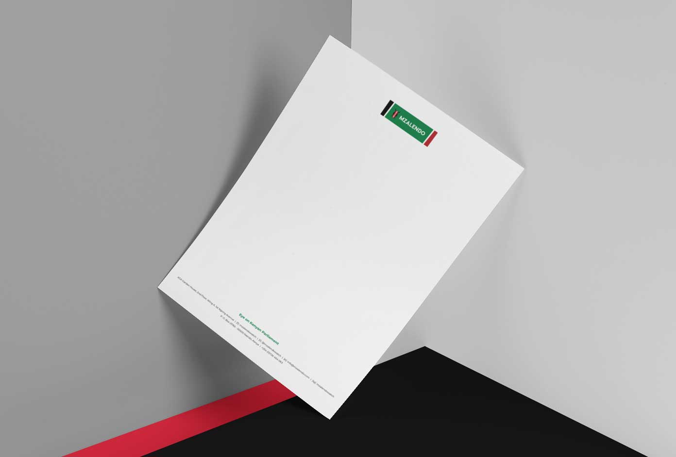
Download the letterhead template
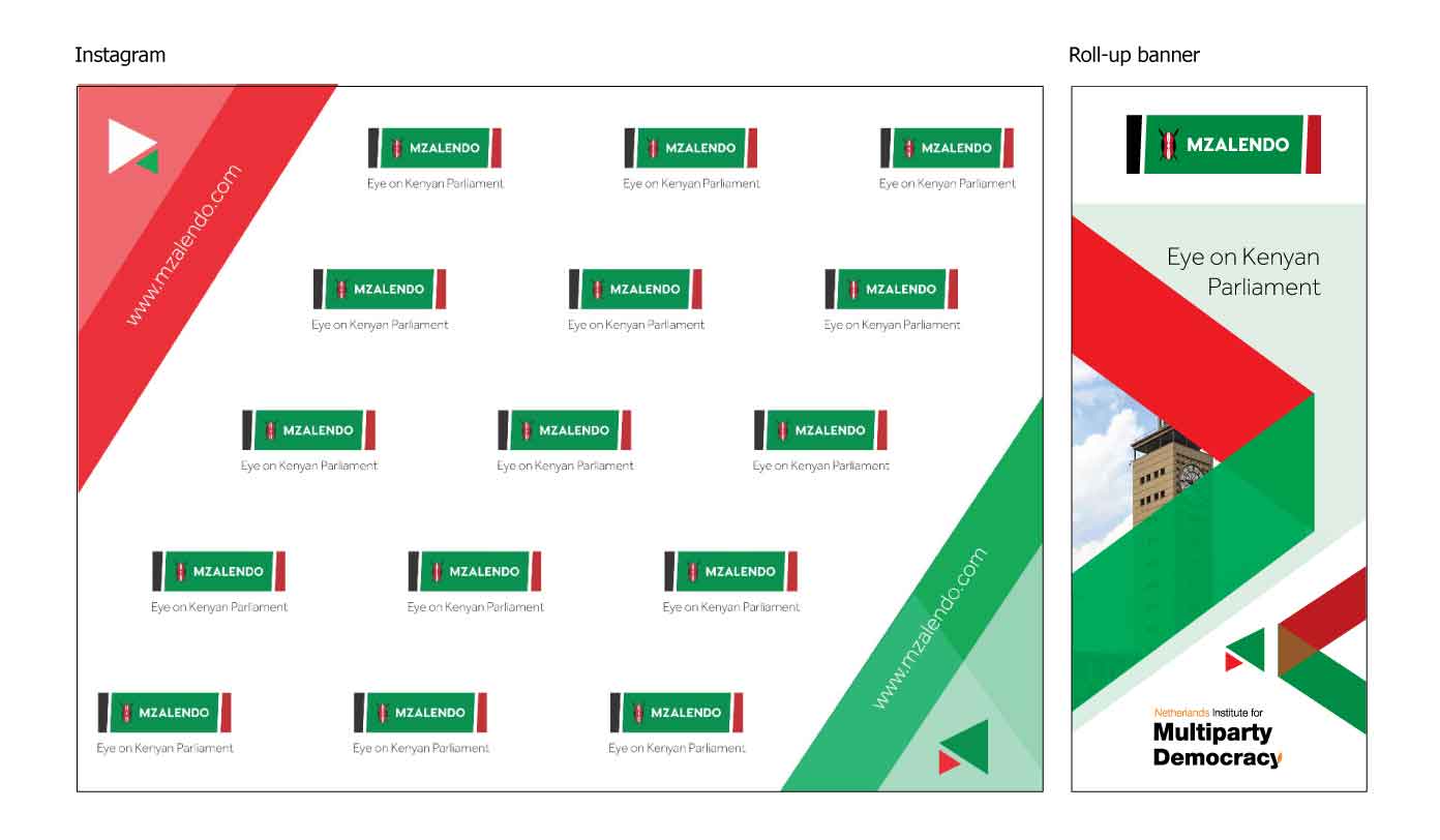
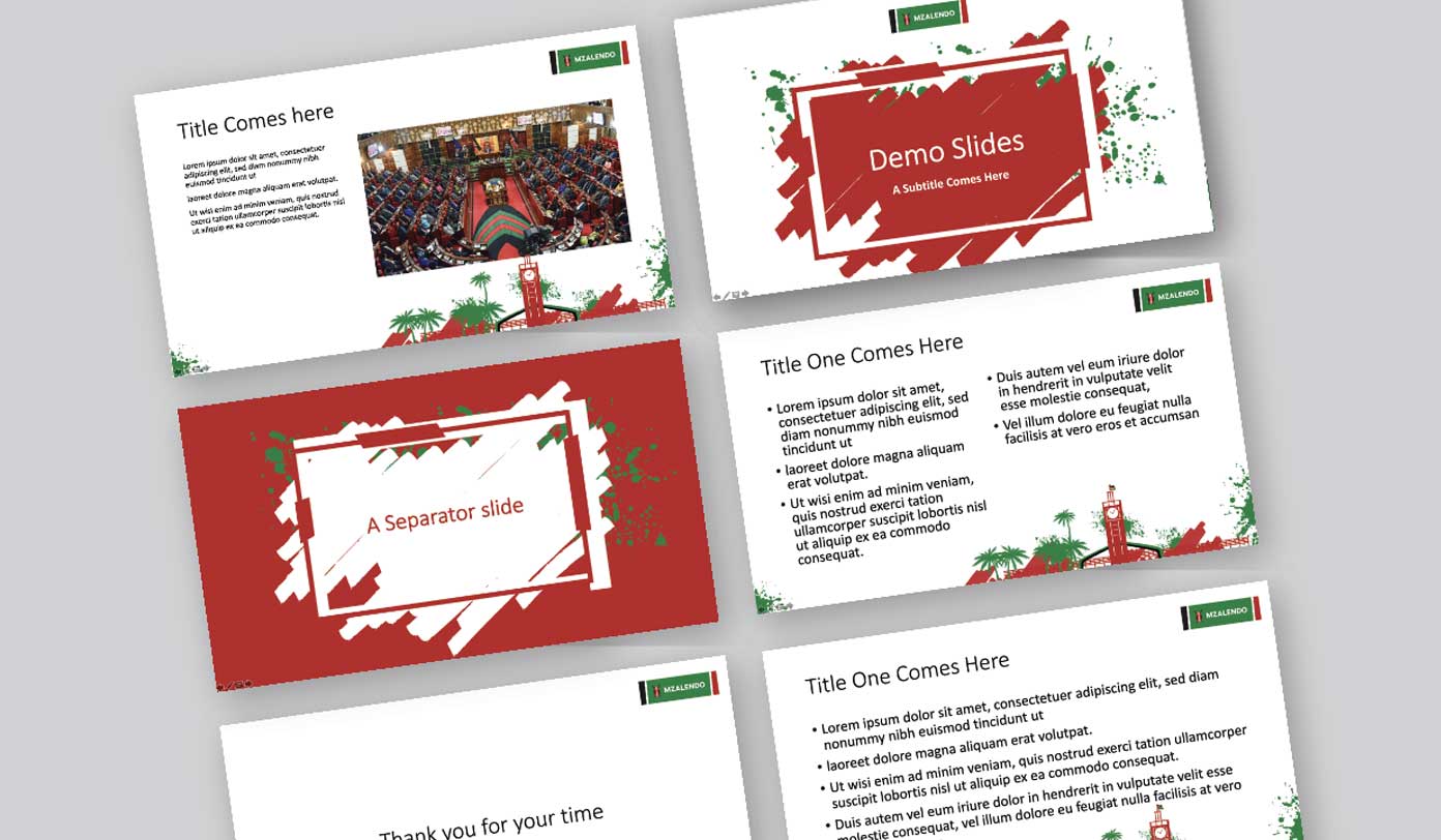
Download the Microsoft PowerPoint template